Every December, Pantone announces its Colour of the Year – a single hue to reflect the mood of the coming months and provide creative direction for designers, brands and marketers. For 2026, as you know, the almost-white colour has been a big conversation.
It’s unexpected and the reaction caused a disturbance among a vast audience.
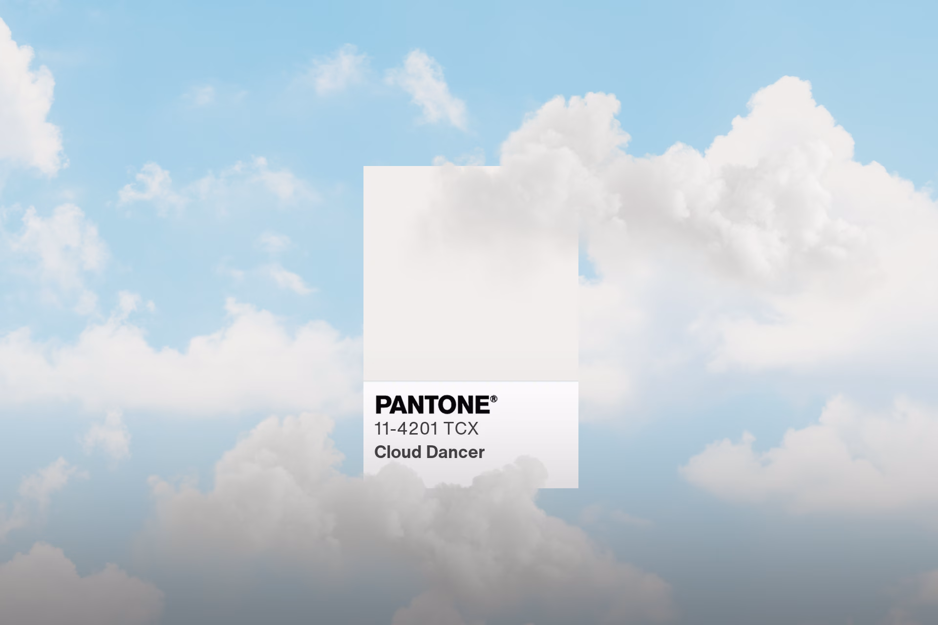
What Pantone says Cloud Dancer represents
Pantone describes Cloud Dancer as ‘billowy white’ and an ‘aerated presence’ – a shade to symbolise calm and a fresh start in a world overloaded with information. The idea is that white is a blank slate, a design space where ideas have breathing room.
As Pantone describes it, it isn’t just a colour, it’s a signal to people to pause in the chaos and reset before creation begins again.
The expected Colour of the Year backlash
Not everyone saw serenity in their Colour of the Year.
Many designers, marketers and commentators took to social media and industry forums to voice their disappointment. Some called their choice uninspired or even a marketing stunt, arguing that Pantone had an entire rainbow to choose from.
Others went further, suggesting that elevating a white hue in 2026 could feel culturally ‘Pantone-deaf’, given global social and political conversations about representation and context.
Some observers also framed it as creative fatigue or recession-era aesthetics.
The industry defenders of Pantone’s 2026 choice
Thankfully, we can rely on the public to agree to disagree. Not every reaction was negative.
A smaller but vocal group of designers and print professionals welcomed the choice. They argue that white isn’t simple, it’s nuanced and mastering white space and subtle off-whites is a genuine craft in both visual and material design.
For print and production specialists, whites are never just white, they’re warm, cool and textured – all of which can dramatically change the contrast and finish. Cloud Dancer offers space to explore restraint and control at a time where design is competing to be the loudest.
Some outlets, like Glamour, noted that the intensity of the cultural debate says less about Pantone’s intent and more about the current climate – where even a colour choice can spark broader conversations around symbolism and interpretation.
Diversity’s take on Pantone’s 2026 Colour of the Year
As designers ourselves, we’re instinctively drawn to colour that carries energy – saturation, contrast and emotional immediacy. So when Cloud Dancer landed, we were curious. To us, the choice leans into psychology – a step away from colour stimulation and into regulation.
Viewed through the lens of the framing bias, Cloud Dancer quietly changes perception. By presenting near-white as a considered choice, it reframes neutrality as intention. The absence of obvious stimulus becomes the message, guiding interpretation before conscious judgement begins.
That’s why it’s so interesting. It reframes how colour functions in an overstimulated visual culture. Near-whites reduce cognitive load, slow perception and create space for focus and interpretation.
By doing this, the colour nudges us away from fast, instinctive decision-making and toward slower, more reflective thinking. Instead of triggering an immediate emotional response, it welcomes consideration.
In a world that rarely stops shouting, Pantone’s quiet choice might just be the loudest one they’ve ever made.