
Web accessibility is about ensuring that people of all abilities can understand, navigate and interact with the web. When we design with accessibility in mind, we create a more resilient and usable product for everyone, not just those with permanent disabilities.
1. Colour contrast (WCAG)
Summary: WCAG (Web Content Accessibility Guidelines) requires specific contrast ratios between text and its background. For standard text, the Level AA requirement is a ratio of at least 4.5:1.
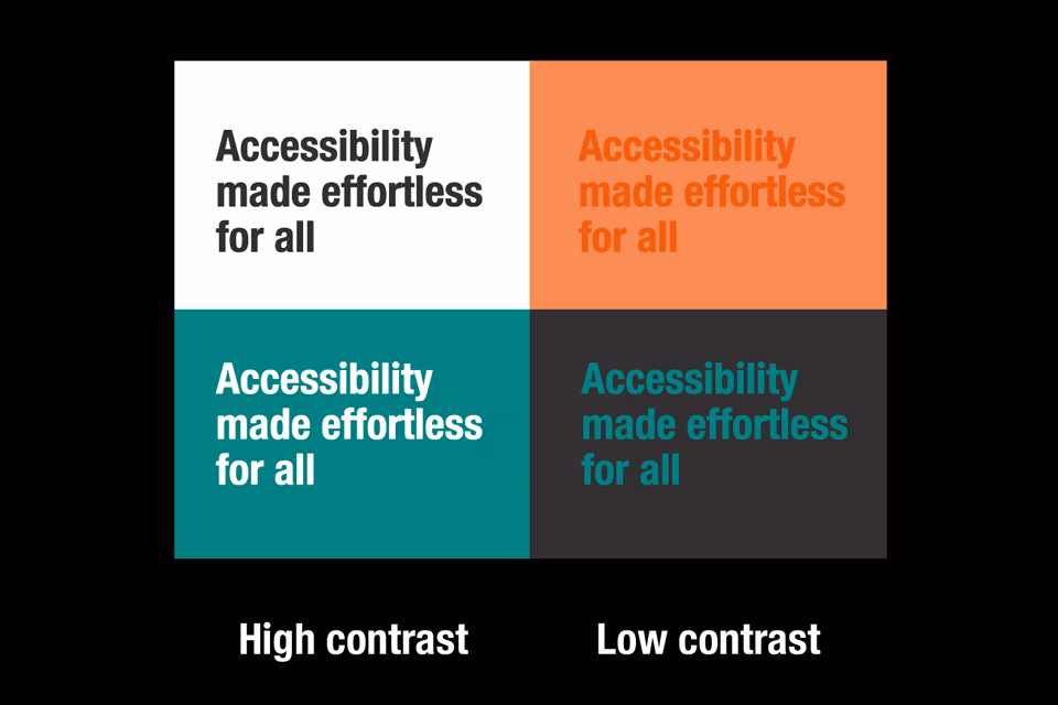
Why it matters for the user:
- Visual impairments
Crucial for users with low vision or colour blindness who may struggle to distinguish text from the background. - Situational constraints
Helps users viewing screens in bright sunlight or on low-quality monitors where colours may wash out. - Reduced eye strain
High contrast improves readability for all users, preventing fatigue during long reading sessions.
How we design in Figma
- Plugins
We use plugins like Stark or Contrast to check layers in real-time for passing contrast levels. - Variable Sets
Defining colour palettes using Figma Variables. Labelling them by their contrast intent (e.g., text-primary-on-white, text-disabled).
How we implement in development
- Relative units
Usage of hsl() or oklch() CSS functions for colours to easily adjust lightness programmatically. - CSS variables
Semantic CSS variables for intuitive colour set grouping and defining, so editing is always one source of truth and not hard-coded hex values across multiple stylesheets. - Testing
Wave Chrome browser extension for WCAG colour contrasts and Google Lighthouse for performance and best practice checks.
Typography
Summary: accessible typography focuses on font choice, size, line spacing, and the ability for users to scale text up to 200% without breaking the layout.
Why it matters for the user:
- Cognitive accessibility
Dyslexic-friendly fonts and generous line spacing (usually 1.5x font size) make it easier to track lines and decode words. - Age-related decline
As users age, visual acuity naturally drops; scalable, legible type ensures they can stay engaged with your content. - Information processing
Clear hierarchy (using H1, H2 tags) helps screen-reader users understand the structure of the page instantly.
How we design in Figma
- Plugins
Text resizer simulates how your layout looks when a user scales the base font to 200%. It’s the best way to catch overlapping text early. - Audit plugin
Stark’s Typography Analysis highlights font sizes below 12px or line heights that are too tight for WCAG standards.
How we implement in development
- Relative units
Usage of rem units for font-size, ensuring all hierarchy of font-sizes are relative to the root font-size usually the browser default value of 16px. - Fluid type
Usage of the CSS clamp() function for responsive scaling: font-size: clamp(1rem, 2vw + 1rem, 3rem) – this ensures text is readable on mobile but grows proportionally on large screens.
3. Responsive design for mobile
Summary: responsive design ensures a website fluidly adapts to different screen sizes and orientations (portrait vs. landscape).

Why it matters for the user:
- Motor impairments
Users who mount tablets to wheelchairs in a fixed orientation need the site to work perfectly in that specific view. - Low vision/zoom
Many users browse at high zoom levels on desktop; a responsive site treats that “zoom” as a mobile viewport, preventing the need for horizontal scrolling. - Physical reach
Mobile-responsive design places interactive elements (buttons/links) within easy reach of a thumb, assisting those with limited hand dexterity.
How we design in Figma
- Auto layout
Essential for mimicking CSS Flexbox ensuring that as you shrink a frame, elements wrap exactly as they would in a browser. - Must-have plugin
Adee Comprehensive Tool features a “Touch Target” checker that places 44x44px or 48x48px overlays on your buttons to ensure they are large enough for fingers.
How we implement in development
- Intrinsic sizing
Usage of min-width and max-width instead of fixed width: 320px allowing content to naturally flow and not be restrained. - CSS Grid
Usage of grid-template-columns: repeat(auto-fit, minmax(250px, 1fr)); to let the browser determine the number of columns based on available space.
4. Dark themes
Summary: a dark theme (or “Dark Mode”) provides a light-on-dark colour scheme that reduces the overall luminance of the screen.
Why it matters for the user
- Photophobia and light sensitivity
For users with conditions like cataracts or certain types of migraines, a bright white screen can be physically painful. - Visual clarity
Some users with low vision find that light text on a dark background “bleeds” less, making characters appear sharper. - Environment adaptation
Reduces “screen glare” in low-light environments, reducing eye strain and improving the experience for neurodivergent users who may be sensitive to sensory overload.
How we design in Figma
- Figma variables (modes)
Create a single variable (e.g., surface-primary) and give it two values: a “light” mode value and a “dark” mode value. - Must-have plugin
Appearance can quickly generate a dark mode version of your entire page by flipping your variable modes, allowing you to re-audit contrast for the dark theme.
How we implement in development
- System preferences
Usage of @media (prefers-color-scheme: dark) to hook into the user’s OS settings and also a ‘.dark’ class name or data-theme=’dark’ data attributes to flip the CSS colour variables to dark mode. - Image attenuation
Apply a slight filter to images in dark mode to prevent “visual glare” for sensitive eyes: filter: brightness(0.8) contrast(1.2);